A Brand for a Cause
The North Carolina Human Trafficking Commission and the North Carolina Department of Justice asked us to partner with them to craft a brand identity that would help represent them to their multiple stakeholders.
Discovering Strategic Purpose
Like always, we started by asking the question “why?” Turning to our discovery toolbox, we used collaborative exercises to explore the organizational value transactions happening between the different parties, eventually learning that we needed to unravel and navigate the complex dynamics between all of the NC HTC’s audiences.

Exploring Complex Audiences
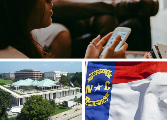
We quickly realized that there were multiple primary audiences that required high degrees of attention, two of which quickly stood out: 1) Other non-profit organizations that were seeking legislative funding to fight human trafficking, and 2) the NC State Legislature overseeing the release of such funding. In other words, our brand needed to carry the authority of state sponsorship to other non-profits and the gravity of the cause to the NC State Legislature.
Focused Inspiration
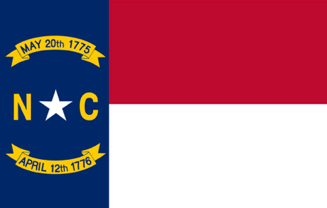
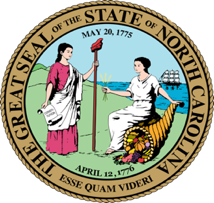
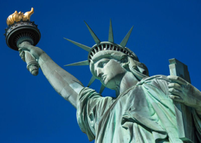
To do this, we turned to inspiration from the limited array of North Carolina State iconography, chiefly the state flag and the state seal. We also looked towards marrying that symbolism with iconography that represented freedom and hope, purposefully striving for aspirational concepts and staying away from symbols of oppression.

Type & Color Theory
For fonts and colors, we looked towards keeping a modern stylistic approach, pairing iconography of the state of North Carolina with a sans-serif font to give a modern aesthetic towards a government affiliated organization. We then landed on a palette of stable and professional blues, inspired by the National Human Trafficking Hotline’s colors.