The Front Door To Resources for Startups
We cultivate founder-led startups and their employees in North Carolina’s Research Triangle Region
Prepared by


A remarkable, ever-changing, and ever-growing connected group of people, the American Underground is more than just space. It lives and breathes, just like the companies it nurtures within its ecosystem; and to start our brand alignment, we went to the people who know it best to identify the key values, emotions, and modifiers that form the pillars of this unique community.

Concept
What We Learned
Through our findings, we discovered four key learnings that appeared over and over again:
01
Ethical
We don’t take shortcuts. We’re in it to succeed the right way. We champion innovators who do the same.
02
Authentic
We are unabashedly ourselves – immune to trends and not interested in pleasing the masses.
03
Ecosystem
We are more than just space. We are a living, breathing, interconnected entity that is not defined by four walls and an elevator.
04
People
We develop people. Whether individually or in teams, people will always be the beating heart of our business.

Inspiration
To start crafting the visual identity for the new American Underground brand, we chose to honor the American Underground’s origin by beginning our inspiration journey with real estate. We looked at artwork influenced by architecture and illustrations generated from the discipline of drafting.
We then incorporated our core findings, drawing inspiration from organic components such as landscapes and ecosystems, but ultimately, keeping the reflected heart of the American Underground: people.

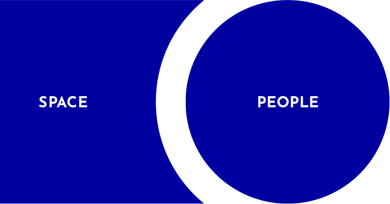
Space + People
Once we determined that our two core components would combine space and people, we were able to construct a strategic visual framework that helped scaffold out the rest of the brand identity.
System
The System
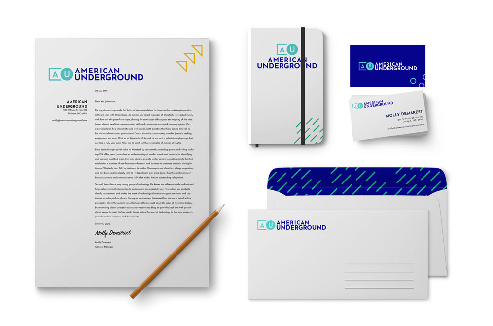
The AU brand system is made up of six key elements.
Identity
Composition

Patterns

Typography
Color

Iconography
Execution
Identity
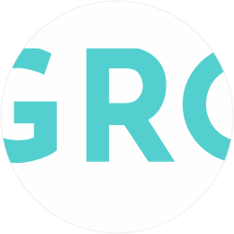
Logo

Horizontal

Vertical

Mark

Icon
Usage
To maintain brand consistency, we have defined the following usages for how to display the AU Logo family:
Two Colors
When expressing the logo in multiple colors, the mark and the type will each be their own color in their entirety. Specific color pairings will be outlined in the color section.

Monochromatic
When expressing the logo in single color or in black & white, the logo should be a uniform color and alpha.

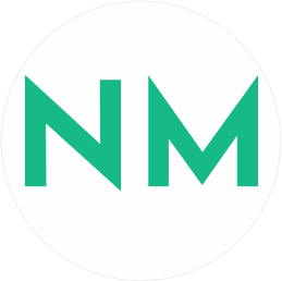
AU Mark
Except for special circumstances, in smaller visual footprints, preference shall be given for the AU mark over the AU icon.

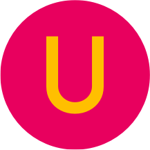
AU Icon
When using for sub brands and co-brands or for extremely small visual footprints (i.e. favicons), use the AU icon.
Sub Brands
When using the AU to co-brand or present American Underground sub-branded programs, we have defined the following usages for how to display the AU identity:
AU Icon
When showcasing the AU brand alongside paired space or programs, only the AU Icon shall be used to feature the smallest visual footprint.
Monochromatic
When displaying the AU co-brands or sub-brands, only a single monochrome color shall be used for both the icon as well as the paired text.

Space
For AU locations, we developed a special instance that curves the location name around the icon, reflecting an inspiration from real life signage.
Composition
Composition
Highlighting our core principle of Space + People, we cascaded the framework into composition of imagery, photography, and content. When framing content that is informational or inorganic in nature, we suggest a preference for displaying in boxes and square lines.
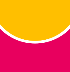
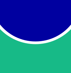
Natural
Conversely, when framing content that is organic and natural, we suggest a preference for showcasing in filled circles or alternatively, curves generated from a circle.


Juxtaposition
These use cases are most prevalent when displaying imagery together, masked by the AU mark.


Patterns
Patterns
In addition to the logo family and composition rules, we looked to providing a set of supporting patterns to emphasize the core values that we drew out of original findings. We landed on a set of three patterns to amplify these values:

Rain
Drawing inspiration from a gentle shower, this pattern highlights the nurturing value of a growing, organic, ecosystem.

Arrows
The rising triangles pay homage to the energy, movement, and hustle that our community of entrepreneurs embodies.

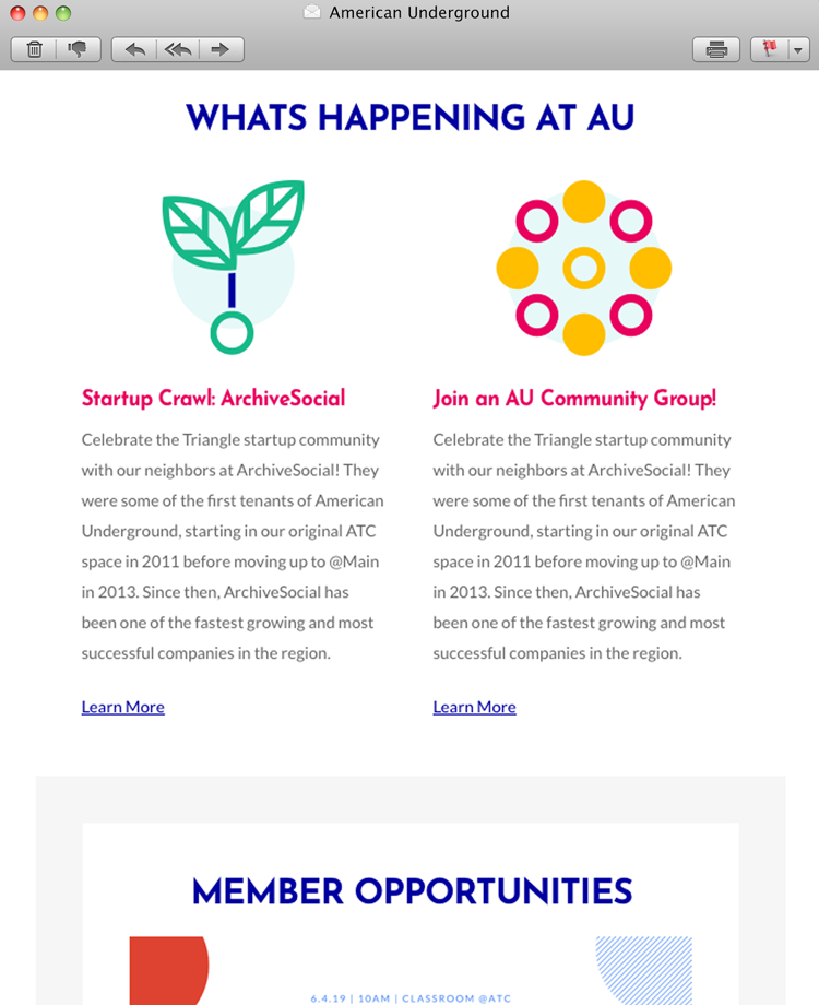
Circles
Taking our core symbol for people, a circle, we generated a repeated dot pattern to reflect the community-based nature of the AU landscape.
Usage
To prevent confusion of the brand identity, and to simplify our visual composition, we have defined the following rules for how to use the patterns:

Images
White


Colored Backgrounds
Typography
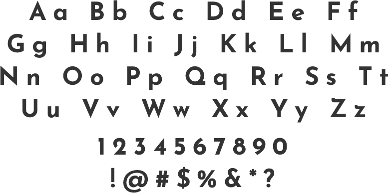
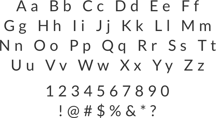
Typography
For type selection, we again returned to our core values, looking for a display font that embodied the energy of the people in the AU community and a body font that conveyed the approachability of the authentic value of the AU brand.
Display
Josefin Sans Bold
Body
Lato Regular
Display
For our display font, our search for a typeface yielded a choice that illustrated three core principles:
The clean lines and angles of Josefin Sans communicated the energy we were looking for that you find orbiting all startup founders.
The consistent, uniform line widths reflected the same motifs that we saw in the architectural influences that we drew inspiration from.
The sharp, pointed ascenders and descenders that extend beyond the capline and baseline provided a feeling of edgy authenticity that embodies the AU community.
Body
For our body font, we chose the typeface, Lato, focusing on its following characteristics:
Lato was an easy, sans-serif font with an approximate 1:1 aspect-ratio character typeset, making large text blocks easier to read and imparting a high degree of approachability.
The variating widths on the connecting strokes within each character gave us the other side of the core influence missing from our display font: the organic, nature-based, stylistic influence.

Color
Color
Drawing from our various inspirations, we decided that expressing the complex energy of the AU community required us to deviate from the classic color paradigm of Primary, Accent, Base palettes. Instead, we focused on a larger array five primary and accent colors. Our challenge, then, was to figure out how to balance the needs of five strong colors in our execution.

Royal
Blue
#0000A0
C100 M97 Y2 K4
Trust
Loyalty
Security

Medium
Turquoise
#54CECE
C58 M0 Y24 K0
Freedom
Joy
Self-Expression

Mountain
Meadow
#16B987
C75 M0 Y64 K0
New Life
Nature
Growth

AU
Pinkle
#E9005E
C2 M100 Y44 K0
Compassion
Energy
Playful

Sunflower
Yellow
#FFBF00
C0 M27 Y100 K0
Opportunity
Positivity
Happiness
Balance
To mitigate the risk of the chaos that comes with having so many competing colors, we determined that our multiple colors will only be used with the following color pairings. This allows the AU brand to retain the various emotions that each color yields, while still keeping controls over abject disorder.


Iconography
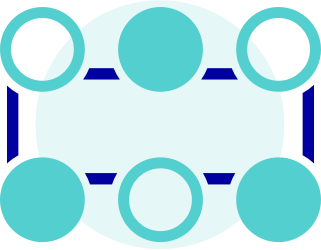
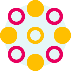
Iconography
In addition to the other core elements behind the AU brand identity, we hoped to provide a simple ruleset for iconography when used to communicate values. After iterating on nearly a hundred different icons and values, we landed on offering a set of three icons, from which we can draw implied rules for future icons:
Startups
Community
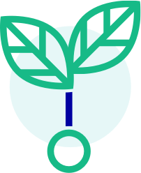
Ecosystem
Guides
From our iterations, we’ve determined that there are three guiding principles when crafting illustrative icons for AU values:

Circle Background
With a circle backing the icon content, we bring balance and uniformity to the icon space and ground the icon subject on a symbol of human-centeredness.

Simplicity
We suggest that all elements that construct each illustrative icon should use simple lines and shapes, allowing the concepts to be easily understood.

Spacing
To communicate how each element in the AU ecosystem is uniquely independent, we recommend that core elements always retain consistent spacing from each other.
Execution
Execution
Bring your best, we’ll bring the rest.
x
